The History of the Quimbaya Logo in Latin America
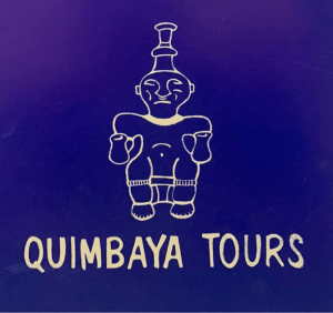
Quimbaya logo was first born on paper, drawing the image of the Quimbayas! Quimbaya is the name of an ancient Colombian civilization from the 15th century renowned for its highly developed social organisation and its remarkable goldsmith pieces characterized by technical accuracy and detailed designs. ✈️
After 7 years of existence, it was time to give more life to the logo! A new design including a new font and a new color, making it more real and with more perspective. 🥰
6 years later, our logo needed a splash of colors to enhance the gold! A mix of mustard, orange and red colors was perfect. 🟠🔴

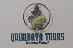
For Quimbaya’s 20th anniversary, the logo makes a digital appearance with one fixed color in burgundy and the addition of the International word to strengthen its worldwide reach. 😍

On the 25th anniversary, the logo had a big revamp to provide modernity and to make our Quimbaya more alive! A bit of 3D, a new font, a new colour, and the result was amazing! ✨

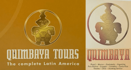
5 years later, a new logo was born with a new brand name made: Quimbaya Latin America. This was to reinforce our destinations 🔥
35 years is something to celebrate! Despite the last 2 difficult years in the world and tourism, we are happy to be back with our 11 destinations and one strong continent attracting tourism from all around the world. For this great reactivation and celebration, we are happy to present our new logo! 🎉
1987
1994
2000
2007
2012
2017
2022
1987
Quimbaya logo was first born on paper, drawing the image of the Quimbayas! Quimbaya is the name of an ancient Colombian civilization from the 15th century renowned for its highly developed social organisation and its remarkable goldsmith pieces characterized by technical accuracy and detailed designs. ✈️
1994
After 7 years of existence, it was time to give more life to the logo! A new design including a new font and a new color, making it more real and with more perspective. 🥰
2000
6 years later, our logo needed a splash of colors to enhance the gold! A mix of mustard, orange and red colors was perfect. 🟠🔴
2007
For Quimbaya’s 20th anniversary, the logo makes a digital appearance with one fixed color in burgundy and the addition of the International word to strengthen its worldwide reach. 😍
2012
On the 25th anniversary, the logo had a big revamp to provide modernity and to make our Quimbaya more alive! A bit of 3D, a new font, a new colour, and the result was amazing! ✨
2017
5 years later, a new logo was born with a new brand name made: Quimbaya Latin America. This was to reinforce our destinations 🔥
2022
35 years is something to celebrate! Despite the last 2 difficult years in the world and tourism, we are happy to be back with our 11 destinations and one strong continent attracting tourism from all around the world. For this great reactivation and celebration, we are happy to present our new logo! 🎉